Background Image Zoom In On Hover
July 12, 2019 by Andreas Wik
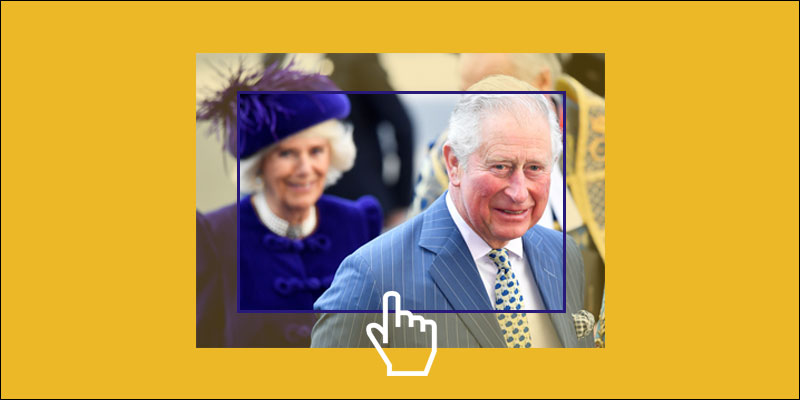
You can see this effect being used quite a lot. When you hover a link to a blog post or article, the image is zoomed in on, or gradually enlarged.
One way to do this is to create a parent element with overflow set to hidden, and inside of the parent create a child element with width and height set to 100% and has the image set as its background.
When the user then hovers over this child element, we use transform: scale() to enlarge it. To animate it, we simply use transition on the child element.
First, the HTML. A parent container and inside of it a child element which will have an image set as its background:
<div class="article-container">
    <div class="article-img-holder"></div>
</div>
Next, the CSS. The interesting stuff here is the class article-img-holder which has the image set as its background and is enlarged and animated on hover.
.article-container {
    width: 300px;
    height: 200px;
    border: 1px solid #000000;
    overflow: hidden;
    position: relative;
}

.article-img-holder {
    width: 100%;
    height: 100%;
    background: url(https://awik.io/demo/background-image-zoom/traffic2.jpg);
    background-position: center;
    background-size: cover;
    background-repeat: no-repeat;
    transition: all 1s;
}

.article-img-holder:hover {
    transform: scale(1.2);
}
The result:
See the Pen Background image zoom in with CSS by Andreas Wik (@andreaswik) on CodePen.
Adding a linked title (problem)
What if we wanted a linked title over the image? We could simply add a link inside of the parent. Let’s put it in the bottom.
<div class="article-container">
    <div class="article-img-holder"></div>

    <!-- Link title -->
    <a class="article-title-link" href="#">Music that will wake you up on your way to work</a>
</div>
.article-title-link {
    color: #ffffff;
    text-shadow: 1px 1px 1px #000000;
    font-size: 20px;
    font-weight: bold;
    position: absolute;
    bottom: 0;
    padding: 10px;
    text-decoration: none;
}
.article-title-link:hover {
    text-decoration: underline;
}
Unfortunately, this doesn’t work that well. Check out the CodePen below and you’ll notice that the effect doesn’t take place when you hover the link, only when you hover directly over the image container element.
See the Pen Background image zoom with link (only CSS, not working well) by Andreas Wik (@andreaswik) on CodePen.
JavaScript to the rescue
A quick way to fix this, and that works really well, is to simply binding a mouseover and mouseout event to the parent container, and when these events fire manipulate the CSS.
Remove the .article-title-link:hover code from your CSS and simply add this piece of JavaScript at the bottom of your page (I’m using jQuery here).
$(document).ready(function() {

    $('.article-container').mouseover(function() {

        $(this).find('.article-img-holder').css('transform', 'scale(1.2)');
    });

    $('.article-container').mouseout(function() {

        $(this).find('.article-img-holder').css('transform', 'scale(1)');
    });
});
Now it works nicely, zooming in wherever you hover:
See the Pen Background image zoom with CSS and JavaScript by Andreas Wik (@andreaswik) on CodePen.
Share this article