Create Wavy Section Divider With SVG and CSS
July 26, 2023 by Andreas Wik

A nice and quick way to create a beautiful wavy border between sections on your website is to use SVG for t. You could, of course, create this from scratch using your favorite graphics tool such as Figma, but for our use case there are tools that gets the job done a lot quicker.
This is the result we’re after:
See the Pen Untitled by Andreas Wik (@andreaswik) on CodePen.
Basic code
But first, let’s start with some markup:
<section class="section-top">
  <h1>Lorem Ipsum Dolor</h1>
  <p>Lorem ipsum dolor sit, amet consectetur adipisicing elit. Non perspiciatis ipsa officia, laudantium porro sed quis odit, distinctio sunt ex atque impedit recusandae id expedita sint voluptatibus placeat.</p>
</section>

<section>
  <h2>Lorem Ipsum Dolor</h2>
  <p>Lorem ipsum dolor sit, amet consectetur adipisicing elit. Non perspiciatis ipsa officia, laudantium porro sed quis odit, distinctio sunt ex atque impedit recusandae id expedita sint voluptatibus placeat, quaerat veritatis ipsum culpa accusantium? Cupiditate dolores magnam, fugiat sint dolorem soluta, inventore placeat repellendus asperiores aperiam, quam ab a. Natus, excepturi!</p>
</section>
So, we have two sections with some text inside of them.
A bit of styling:
body {
  background: #f9c73e;
  font-family: Arial, Helvetica, sans-serif;
}

section {
  position: relative
}

.section-top {
  background: #ee6251;
}
Create the SVG
shapedivider.app is perfect for what we want to achieve. Head over there and tweak the values. You will want to set the color to the same background color as the bottom section element, #f9c73e in our case. Also choose Bottom in the top/bottom divider setting.
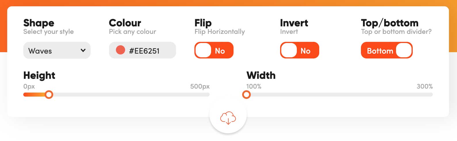
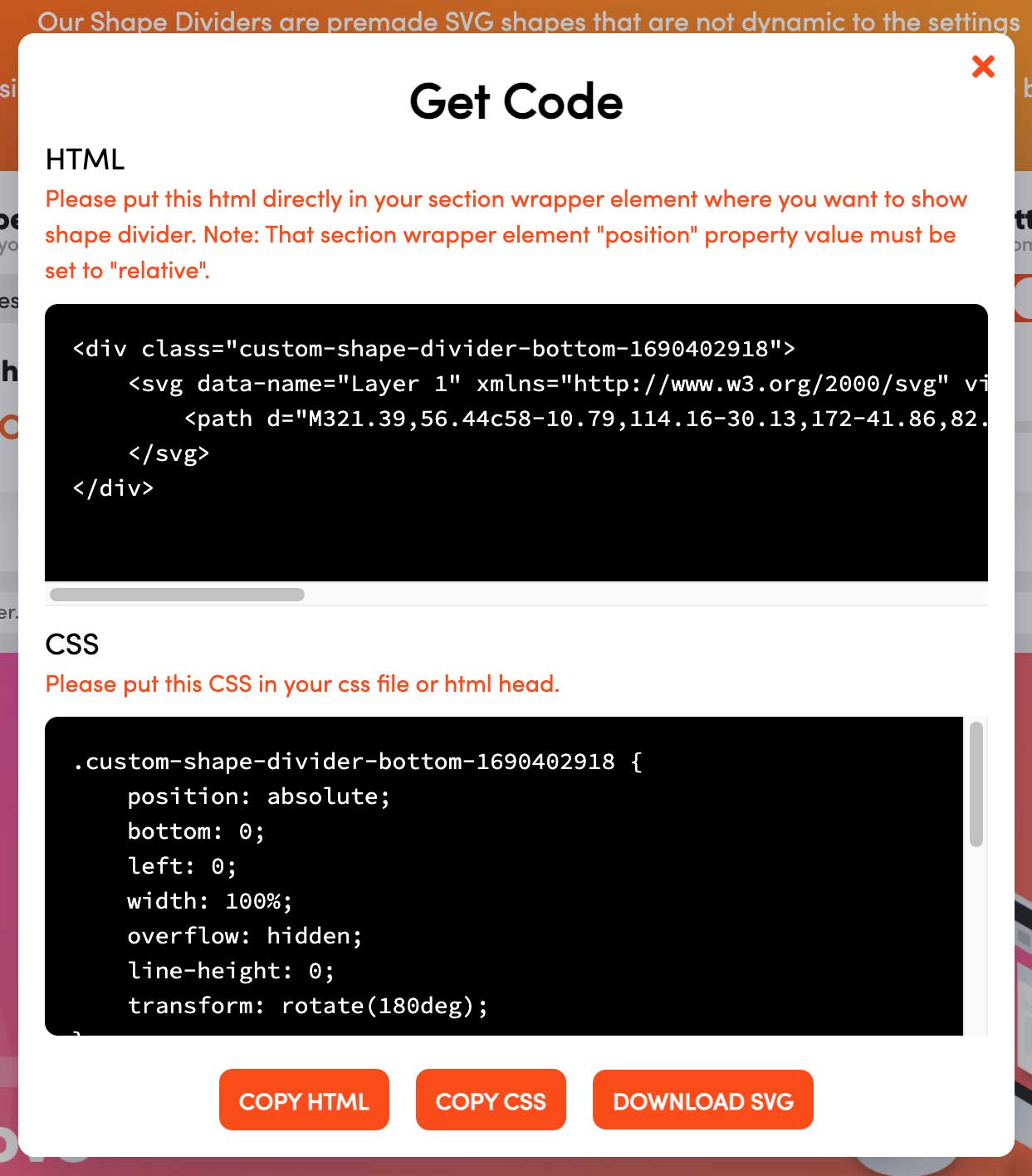
Click the little cloud button underneath the settings and you’ll get presented with HTML and CSS.
Put it all together
Let’s copy the HTML and paste it into the bottom of our top section.
<section class="section-top">
  <h1>Lorem Ipsum Dolor</h1>
  <p>Lorem ipsum dolor sit, amet consectetur adipisicing elit. Non perspiciatis ipsa officia, laudantium porro sed quis odit, distinctio sunt ex atque impedit recusandae id expedita sint voluptatibus placeat.</p>

  <div class="custom-shape-divider-bottom-1690379446">
    <svg data-name="Layer 1" xmlns="http://www.w3.org/2000/svg" viewBox="0 0 1200 120" preserveAspectRatio="none">
        <path d="M321.39,56.44c58-10.79,114.16-30.13,172-41.86,82.39-16.72,168.19-17.73,250.45-.39C823.78,31,906.67,72,985.66,92.83c70.05,18.48,146.53,26.09,214.34,3V0H0V27.35A600.21,600.21,0,0,0,321.39,56.44Z" class="shape-fill"></path>
    </svg>
  </div>
</section>
Next, we copy the CSS and paste that into our stylesheet.
.custom-shape-divider-bottom-1690379446 {
    position: absolute;
    bottom: 0;
    left: 0;
    width: 100%;
    overflow: hidden;
    line-height: 0;
    transform: rotate(180deg);
}

.custom-shape-divider-bottom-1690379446 svg {
    position: relative;
    display: block;
    width: calc(100% + 1.3px);
    height: 69px;
}

.custom-shape-divider-bottom-1690379446 .shape-fill {
    fill: #f9c73e;
}
As you can see, you can easily change the fill color of .shape-fill, should you need to.
That’s it! A quick, nice way to create a beautiful wavy divider.
See the Pen Untitled by Andreas Wik (@andreaswik) on CodePen.
Share this article