Manipulate Images Dynamically With CSS Filters
July 21, 2018 by Andreas Wik
With CSS filters we can easily manipulate images, such as turning them black and white, make them blurry, adjust brightness, contrast and colors, and more.
Check out this demo (CodePen below) I put together where you can play around with filter values and see the result straight away.
See the Pen CSS Filters by Andreas Wik (@andreaswik) on CodePen.
Let’s have a look at the different filters’ syntax and how they work.
grayscale
This one I like a lot – easily turn the image partially of completely black and white.
Default value is 0% and 100% will turn it completely black and white.
Syntax:
filter: grayscale(80%);
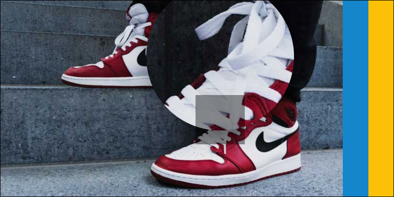
blur
Default value is 0px and the higher the value the more blurry the image will be.
Syntax:
filter: blur(5px);brightness
Default value is 100% and 0% will make the image completely black. The higher the percent value, the brighter the image will be.
Syntax:
filter: brightness(125%);
contrast
Default value is 100% and 0% will make the image completely gray. The higher the percent value, the more contrast the image will have.
Syntax:
filter: contrast(125%);
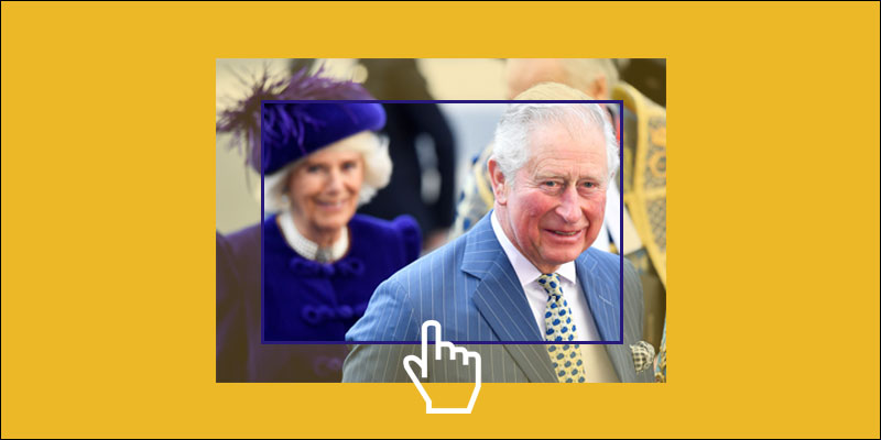
opacity
Default value/max value is 100%. The lower the value, the more transparent the image will be.
Syntax
filter: opacity(50%);
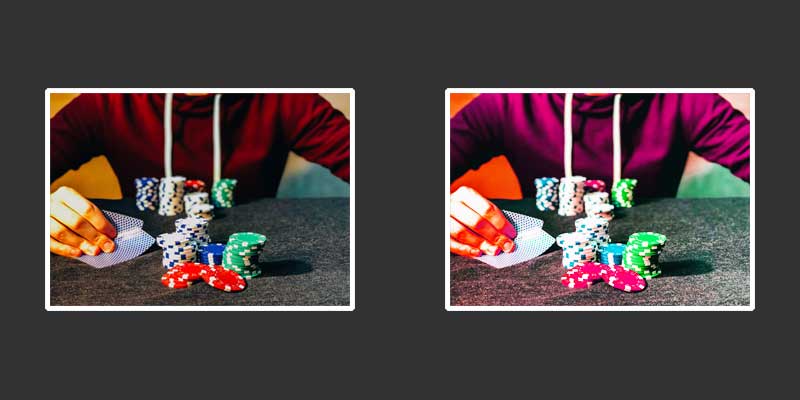
hue-rotate
Add a hue rotation to the image. You pass the filter a degree value which is the degree of the rotation. Default value is 0deg.
Syntax:
filter: hue-rotate(180deg);invert
invert() flips the colors of an image. Pass it a value between 0% and 100%. If no value is passed then 100% is applied.
Syntax:
filter: invert(100%);
saturate
Saturation is used to describe the intensity of colors in an image. Default value is 0% and 100% is a complete saturation.
Syntax:
filter: saturate(78%);
sepia
Sepia is kind of a reddish-brown color, and this filter will turn your convert your image into a sepia. Default value is 0% which will leave the image unchanged, while 100% will be a full conversion of the image. Anything inbetween will ease the conversion.
Syntax:
filter: sepia(50%);
drop-shadow
The drop-shadow filter adds a shadow behind the image. It takes 5 values, only the 2 first being required.
These values are:
<offset-x> (required) which defines the horizontal offset of the shadow. A negative value will position the shadow to the left of the image while a positive value will put it to the right. Pixel value.
<offset-y> (required) which defines the vertical offset of the shadow. A negative value will position the shadow to the above the image while a positive value. Pixel value.
<blur-radius> (optional) defines how blurry you want the shadow to be. The larger the value, the bigger more blurry it’ll be. Pixel value.
<spread-radius> (optional) defines how big of a spread the
<color> (optional) defines the color of the shadow.
Syntax:
filter: drop-shadow(5px 5px 8px 7px #333333);
As always, have a look at the browser support to make sure it’s acceptable for your project.
Share this article